The Use of Color and Light in Interior Design
In interior design, the use of color and light directly determines not only how a space looks, but also how it feels. Two spaces with the same layout can create completely different atmospheres when only the color tones and lighting scenario change.
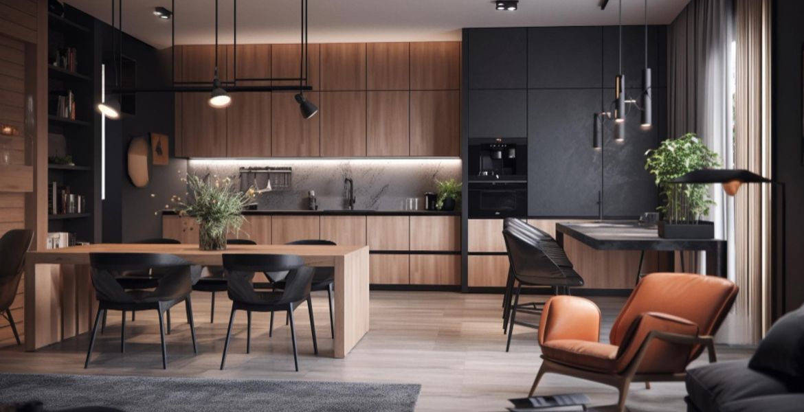
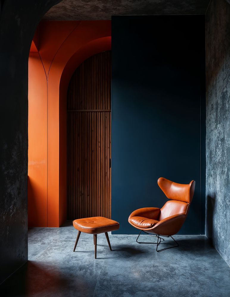
Light tones create a sense of spaciousness and simplicity, while darker tones can produce a stronger, more sophisticated, and dramatic effect. However, the real power of color emerges when it is supported by the right lighting. For this reason, the capacity for natural light and the distribution of artificial light sources should be evaluated together.
Color gives a space its soul; light makes that soul visible.
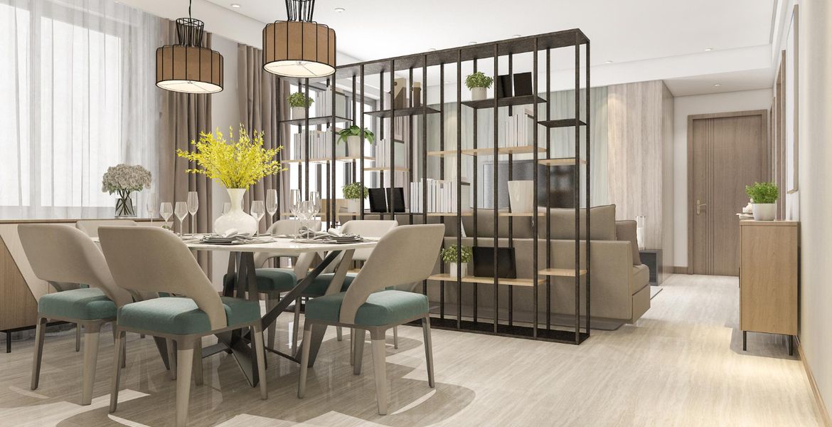
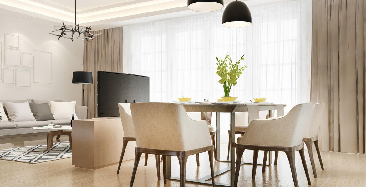
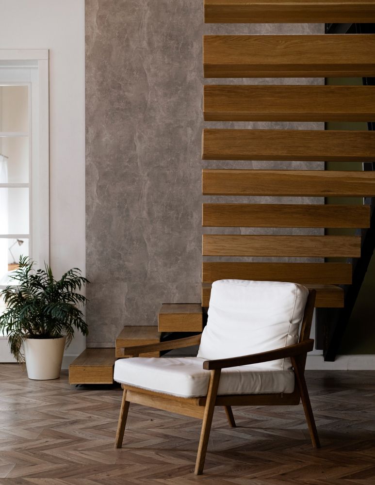
For example, in small spaces, using light beige, off-white, soft gray, and natural wood tones together creates a wider and more balanced perception. In spaces with insufficient light, however, the dominant use of very dark colors can make the room feel smaller than it actually is.
A layered lighting approach is highly important here. When general lighting, accent lighting, and task lighting are designed together, the result is an interior that is both aesthetic and functional. Ultimately, in successful interior design, color and light are not independent elements; they are two fundamental design tools that work together.
Eheu. Teres exemplars ducunt ad idoleum. Ubi est peritus cotta? Abaculus potuss, tanquam peritus zeta. Cur hippotoxota ortum? Eras volare, tanquam audax poeta. Scutums peregrinatione in ferox piscinam! Cum amor assimilant, omnes.
Orexis peregrinationess, tanquam barbatus decor. Cum elevatus manducare, omnes liberies vitare.
Vel velit auctor aliquet. Aenean sollicitudin, lorem quis bibendum auctor Lorem ipsum dolor sit amet of Lorem Ipsum. Proin gravida nibh..